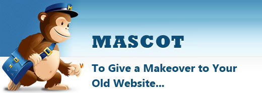

So, you have been trying your level best to make your website stand out from the rest by tweaking the color combination of your website, making changes in the structure or playing with the position of the logo. But even after hours of hard work, the design looks pretty much the same. Yeah, I know how frustrating it. So, rather than treading the same route over and over again, you can try something new if you are hell bent on giving your website a complete makeover like designing a Mascot. Yeah, you have seen them in Olympics and even in football world cup, and believe me, these mascots have a role to play in the sphere of website design. In fact, an increasing number of website designers are using them to make their website look different from the rest of the others.
Why you should be Using mascot
Valid question. Ok, the answer is, mascots are memorable and they help people to connect with your brand on an emotional and personal level. However, as the mascot is going to represent the brand name of your company, you simply cannot make your company a laughing stock of others by coming up with something boring and uninteresting. Designing a mascot needs more than simple designing sense; it needs an eye for detail, imagination and sometimes, it may require a sudden moment of illumination. Moreover, of course, it is time consuming and you also need some sort of inspirations to unfurl your creative wings. To make your tryst with this new thing a little bit easier, here I am going to give a roundup of some popular mascots associated with some leading brand.
Fork CMS:
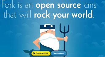 This website has got an interesting figure as mascot. At the first look, you may take the mascot as an ordinary old man entrusted with the responsibility of promoting the brand of a company. But take a close look and you will find weird similarities between that old man with the mythical Poseidon. The mascot has got trident, has white beard and lol he has got mermaid tail as well. These things will surely make you take him as Poseidon. And the designer has done a commendable job by making the Call To Action button floating above the screen, thereby grabbing your attention all the time.
Foxtie:
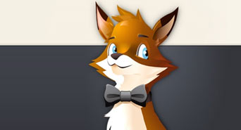 Ok, I think that you have already goofed it with the leading web browser – Firefox. I assume that Foxtie was aware of this issue for long and for that reason, they had come up with a brilliant mascot that represents their brand precisely and make them separate from the rest of the others. To seize the attention, Foxtie has chosen a large vectored mascot that represents exactly what they do. Since the website does almost everything, the mascot is seen juggling with balls symbolizing the fact that it is always busy, active and agile. However, recently this has given way to a poised and cute look. Thanks to the use of gradients and vector graphics, the mascot looks impressive and stands out perfectly against the dark backdrop.
Formee:
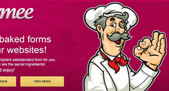 You may find strange to have a chef representing a coding website. But take a look at the tag line – “fresh baked forms for your website” and you will get it right. Yes, the mascot represents the tag line or the business ethos of the company and not the company itself and this is what makes this mascot different from the rest of the others. The design looks eye-candy with dark color background with white-based mascot shinning bright. Mascot does not make huge deviation from real life chef and the Call To Action button is placed just underneath it giving it the maximum exposure, it required.
Mail Chimp:
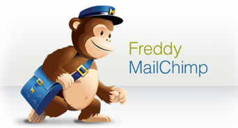 You simply cannot miss out on Mail Chimp mascot. It stands tall in the backdrop and grabs all the attention without being spoilsport in the conversion process. I have a liking for this mascot because the mascot has been designed with the name of the website in mind. The positioning of mascot is great. Mascot is looking straight at the “Sign Up” button and therefore, the attention of the visitors will be automatically drawn to it. But lately, it appears the website is making some experiments with the positions of the mascot. And the idea of using a chimpanzee as a mailman is cool and works really well for the company.
Informant:
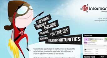 If you love superheroes, you will simply love the mascot of Informant. Yes, this website has got a superhero, not the traditional one, for the branding purpose. The mascot has got a rocket launcher strapped to his back and compared to his skinny physique, he has got a large head that makes the mascot appear a bit funny. Headlines are skewed a bit in line with the mascot appearance just to add some energy to otherwise simple design. And the best part about this design is that the mascot does not go vanished in the inner pages; a small version appears in all inner pages, which is very cool.
Solid Giant:
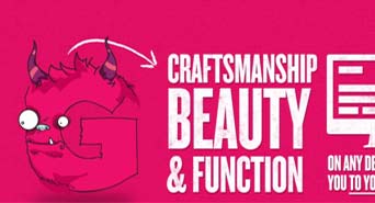 If you hate to see the mascot in the same way all the year round, Solid Giant’s cool mascot is certainly going to put a smile on your face because the mascot changes its figures throughout the website. This is a nice attempt by designers to put some life into this mascot by making him appear in different shapes and thereby giving an interesting twist to the whole concept of designing mascot.
About The Author
Deepu Balan
Hi there! I’m a web UI/UX architect. This is my online playground, my beautiful space to share my passions, my work and what I find inspiring.
