Just a few years ago, designers would not mind if a template has some rough edges like slightly pixelated fonts or images. They would simply not waste their time on getting it fixed as they knew it very well that people are not going to notice those trivialities. But things have changed. Now we have tables, iPads and other devices that people are using to browse the web. And thanks to Apple’s revolutionary retina support technology, people now can squeeze a page 50% or zoom in to 200% on a website almost instantly. Now imagine, how yours pixelated website will look when it will be stretched 150% on a table. That will be for sure a disaster. So, do not let that thing happen with you.
For a web designer, the aesthetics of a site is paramount. And it is the artists and web designers that retina-ready websites seem to appeal to. An innovative concept implemented by Apple, the retina readiness of a site is yet to be mastered by many.
Is it just a passing fad? Or, is it here to stay? Only time will tell. Whatever the verdict, it is best to have a clear idea about the fundamental questions. If you care about how your site looks, you need to find out the basics of retina-ready designs.
What is it all about?
Take a really close look at a blurry image when it’s blown up. You can see tiny dots that make up the image. Those are pixels. When too few pixels occupy a certain portion of the image, it gets blurred. This is pixelation.
When you blow up an image or an element, pixelation occurs and makes the view blurry and ugly. But on a retina-ready site, this doesn’t happen. The greater number of pixels on such sites gives you high quality, smooth visuals without a hitch.
Whether you are just an average person with no design knowhow or an expert web designer, a retina-ready website will look great, and undistorted, whatever browser type, size and scale you use to view it.
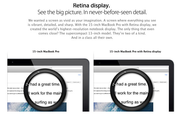
Image Source – Apple Website
Why is it at the centre of attention now?
The reason is simple; initially, web designs were meant for desktops or laptops. But things have changed. You can visit a website from a desktop, a tablet or a Smartphone. And the site must be suitable for them all.
The advent of responsive web design has made it important that you come up with sites that look great irrespective of the browser a user chooses. A web designer must overcome this challenge. And retina-ready sites do just this.
With the diverse range of browsers, a user can tap the screen to make a site appear bigger or smaller. When you make your site retina-ready, this won’t affect its visual quality. The greater pixels will ensure clearer, sharper images and elements.
Why should you give it a thought?
Well, just as you cannot ignore responsive web design anymore, it isn’t a good idea to ignore this concept too. The best advantage of this is that it offers quality images with bright colors and vivid details.
Moreover, on a retina-ready site and device, fonts won’t stretch out and become illegible. This happens when the screen is stretched out or scaled down. It will have a smooth, sharp look that is easily readable. Great for responsive designs!
Today’s trend in web design is all about simplicity and minimalism. But it’s possible to appreciate the subtle touches of a web designer’s creativity only when every element is perceptible. And retina readiness can ensure this.
Where do you begin?
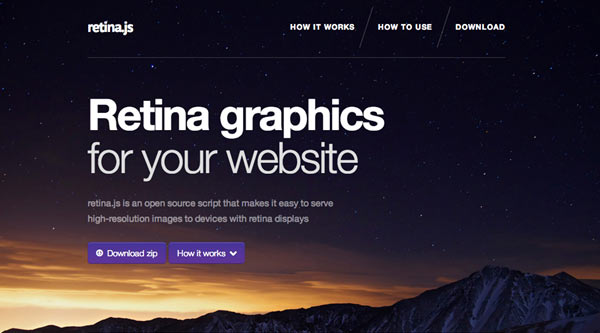
To be retina-ready, you need a little of CSS and JavaScript. Your first step is to use Retina.js JavaScript script. This will tackle the question of where you get high-resolution pictures for your website.
Image Source – Retinajs
The images are an important part of the change. But they aren’t all. You can use the tutorial available from PressCoders to make the next couple of changes. Using CSS and adding icons and buttons can be learned with ease from this lesson.
The Line25 tutorial can help you make retina-ready graphics with Photoshop and Illustrator. If you are running a little late, you may benefit from the MrGeek.Me tutorial on how to create the graphics in Adobe Photoshop CS6 in 4 easy steps.
And what’s more, if you aren’t retina-ready yet, your website is at the risk of looking ugly in front of people who have already bought the Apple devices. Though they represent only a tiny percentage of users now, you never know when tables will turn.
No one knows whether this trend will catch on or just pass by; but it’s a good idea to keep ahead of others. If it does catch on, you will know where to begin. Apple is at the top of this, but don’t let that deter you.
About The Author