
Well, as it seems “Go Responsive” – is the new catchword in the sphere of website designing. As everyone around is embracing this new form of website designing, it is becoming imperative for us to know how to design a responsive website without meddling with its limitless intricacies. And to simplify our tasks, here we are going to share some cool frameworks that will help you design a fully responsive website in a matter of minutes.
However, if you do not know beans about responsive web design (RWD), let me tell you what it is. Responsive web design is a web design approach where the aim is to make a website render precisely on all devices and screen resolutions. An optimal viewing experience is what you can expect with responsive web design technique. There is no need to struggle a lot to make a website compatible with myriads of devices. But the interesting thing about this new web design approach is that it makes a website render differently in different devices and offers an ideal viewing experience without the need for maintaining different set/versions of pages for different devices.
However, these are not going to be the beginners’ stuffs because these responsive frameworks are going to save a lot of your precious time by eliminating the needs to write manually all the basic css codes. So, by embracing any of the following responsive frameworks, you will be able to create mobile specific sites without requiring you to invest much of your productive time.
MUELLER Grid System
This is a modular system for both non-responsive and responsive layouts. This is a powerful framework that gives you complete control over different aspects of the design like – baseline grids, gutter widths, column widths, media queries and more.
It has options to extend the grid to different pre-defined layouts and that means if you wish to develop a 1–column layout with 1/3– and 2/3–fractions, it would not take much time. Just need to select some options and there you go. If you wish, you can use templates as opposed to presentational classes in the mark-ups.
Groundwork CSS
The driving force behind this incredibly powerful responsive framework is that it is built around Sass, which is as we are well aware of a powerful CSS preprocessor. Sass has extended the limit of CSS3 to a great extent by incorporating some amazing features like mixins, nested rules, variables, selector inheritance etc. By harnessing the power of a solid web-framework plugin, Sass has emerged as standard CSS and has become quite popular among web designers.
Fluid grid, nestable and flexible, GroundworkCSS has it all and this is what has helped it offer advanced responsive layout techniques to create powerful websites. With this framework, you can design almost anything. And the best part of GroundworkCSS is that it is open source and that means, you would not have to pay a penny to use it. Designing a responsive layout will be a treat with this framework.
Centurion
Tired of doing all the CSS stuffs all by yourself? Well in that case, Centurion has the ultimate solution. It is built around CSS3 media queries and SASS and this is what has given it an amazing ability letting you create a responsive layout without requiring you to get involved in the process much.
What is all the more unique about Centurion is that it is self-contained and that means, it has fewer files to mess with. A simple yet highly powerful package that you will always be requiring to create a simple yet sophisticated responsive layout.
To complement the minimalist trend, all the elements have been deliberately scaled down so that you can make the most of the gradients, media queries and other cool features. And the best part of this framework is that it is easy to get the hang on it. The classes and ids are easy and they make sense.
And here goes the icing on the cake. The codes are well optimized and that means, it is not going to slow down your website. This framework also comes loaded with Craydent, Coffeescript, jQuery and more and this is what has made it super powerful.
Foundation 4

This Grid framework is highly efficient and at the same time extremely flexible. If you ever happen to use a grid based framework before, I can safely say that you are going to like this one. Boasting an impressive 12-column grid, Foundation 4 is the ultimate framework that you might have been looking for long. With it, you will be able to design complicated layout without doing those silly manual coding things.
Prototyping a website is a breeze with the Foundation. Foundation comes loaded with numerous styles that help you go wild with the interface. Like you can add image sliders, modal dialogues, tabs, multiple buttons, and other things. With it, you will be able to build up sites that support all devices or else you can build up sites to support only one particular device. And the best part of this framework is that it has included CSS styles and that means, you can easily turn on and off certain elements depending on the device types and this is going to have a profound impact on the overall user experience.
Cool Kitten
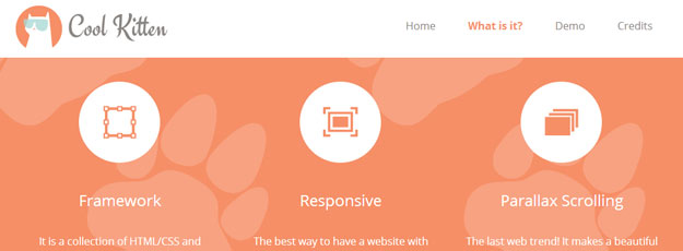
This tool is the Holy Grail for those who are trying to develop a responsive parallax scrolling website. It comes loaded with jQuery Easing Plugin, Stellar.js and Normalize.css that make a robust framework to build highly sophisticated websites.
Gumby 2
This is another open source responsive framework that lets you go wild with your creative parts, as it manages all the dark and ugly sides of coding. Skip links, built-in responsive images, buttons or whatever, Gumby 2 has got everything. As it equips developers with a set of awesome tools, more and more developers are falling in love with it.
Gumby 2 as the company claims it is ‘insanely simple’ to use and apply. By making some changes in the classes and Sass variables, you will be able to make big changes in the entire design, which is really cool.
About The Author